Our profession
The pastry decoration
Helping you stand out from the crowd
We design and manufacture practical, aesthetic and affordable chocolate decorations and molds for professionals in the field of sweet gastronomy.
With quality products
Good chocolate and food colours of natural origin, adapted to the constraints of all our customers
And everything is customisable!
Our experts are there to inspire you and advise you on your tailor-made projects
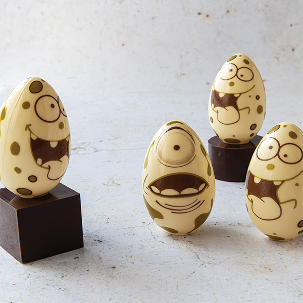
Our flagship decorations
Discover the latest Chocolatree catalog!
Textured milk chocolate egg
Ref. 60083VPM
Easter bunny pink ears
Ref. 31511VPW
Mr and Mrs Easter rabbit
Ref. 43749VPM
Easter rabbit eggs 3 models
Ref. 60148VPW
Easter bunny 4 models
Ref. 43739VPM
News
Easter decoration :
Anticipate the easter celebration
Win a 1000€ professional photo shoot by getting noticed on instagram during Easter!

We are pleased to annouce the release of our new Chocolatree catalog, for 2021-2022.
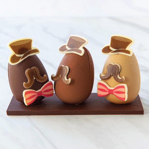
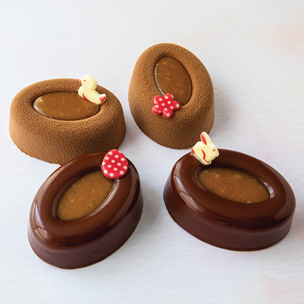
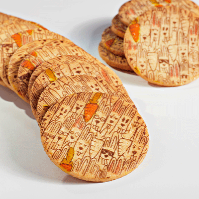
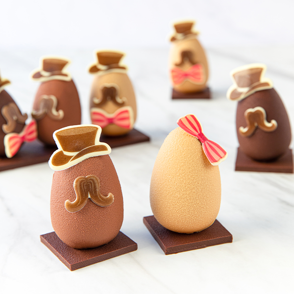
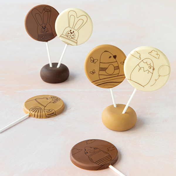
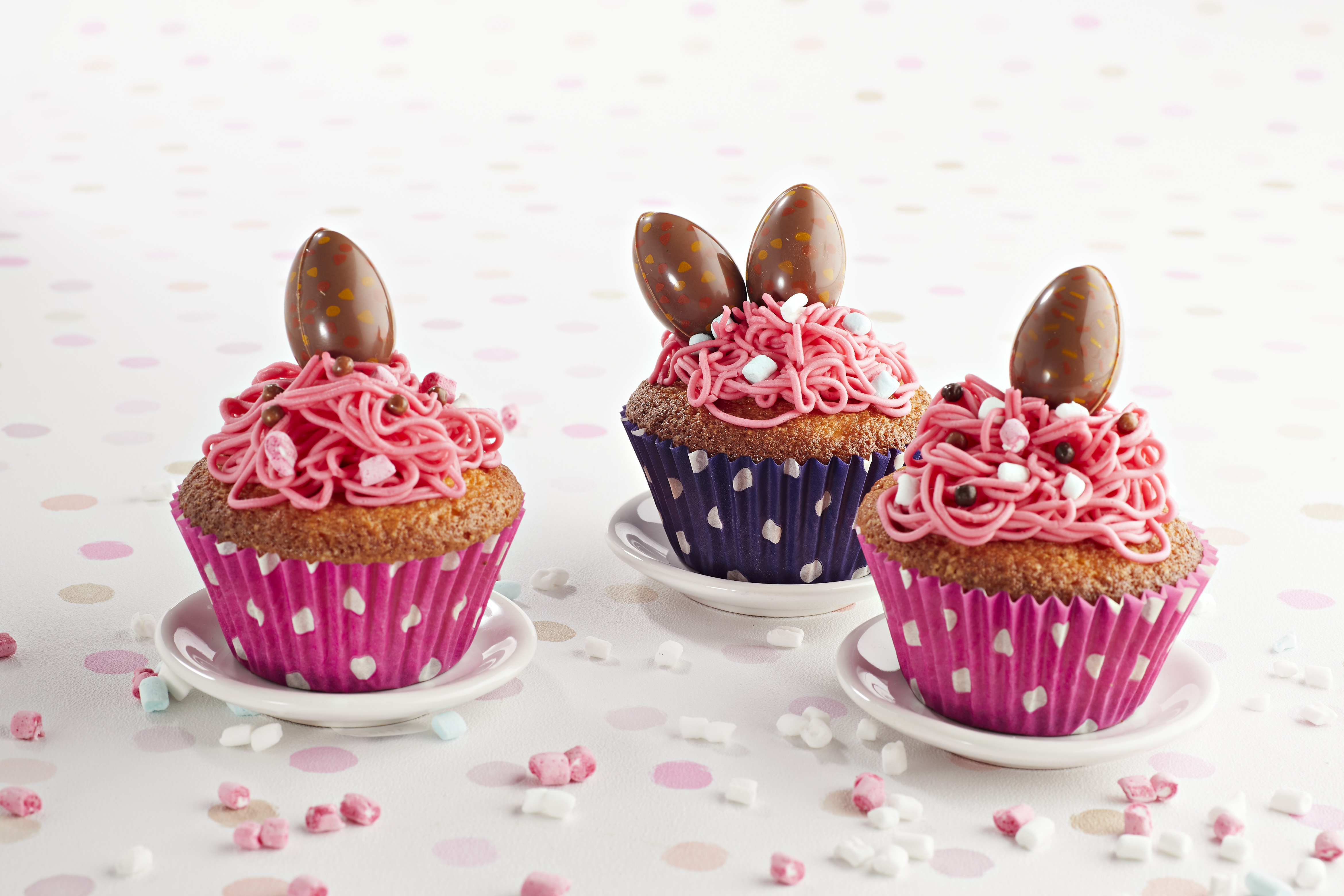
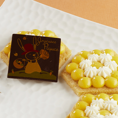
Our creations
Let yourself be inspired by these gourmet creations, decorated by Chocolatree